English
 Deutsch
 Français
 Italiano
 Español
 Türkçe
 Ελληνικά
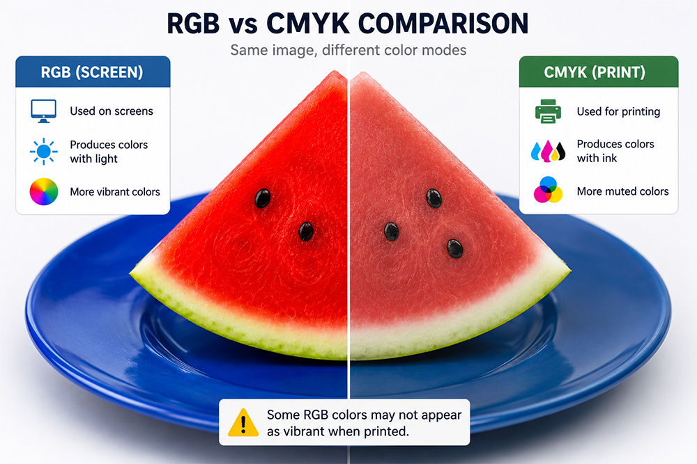
RGB (Red, Green, Blue) and CMYK (Cyan, Magenta, Yellow, Key/Black) are the two primary color models used in digital design and printing. Although both systems are intended to reproduce colors, they operate differently and therefore produce different visual results.
The RGB color model is based on light and is used for digital displays such as computer monitors, televisions, tablets, and smartphones. Colors are created by combining different intensities of red, green, and blue light. Because it uses light, RGB is capable of displaying brighter, more vibrant, and more saturated colors.
The CMYK color model is used in printing processes. Printed materials such as magazines, brochures, posters, catalogs, and business cards rely on CMYK inks to reproduce colors. Since CMYK is an ink-based system, it has a smaller color gamut than RGB. As a result, some colors may appear less vibrant when printed.
As shown in the comparison, the watermelon on the RGB side appears brighter and more vivid, while the blue plate displays a richer and more intense color. On the CMYK side, the same image appears softer and more muted, representing how colors are typically reproduced in print.
This difference explains why designs created on a computer screen may not look exactly the same after printing. Highly saturated reds, blues, and greens are especially likely to lose some of their intensity when converted from RGB to CMYK.
In conclusion, RGB should be used for content intended for digital screens, while CMYK should be used for printed materials. Selecting the appropriate color mode at the beginning of a design project helps ensure that the final result matches the designer’s expectations.